The post NBA Preseason: Predictive or Pointless? first appeared on 'CATS STATS.
]]>To answer that question, we turn, as we always do when faced with such a serious quandary, to the numbers.
Daniel Cowan ‘22 took on the task of answering: does a team’s preseason record have any predictive value on that team’s performance in the regular season?
He examined data from the 2005 NBA season through the 2019 season, looking for any possible trend by plotting the team’s regular season winning percentage against the same team’s preseason winning percentage from the same year. He used winning percentage rather than wins to remedy the fact that not all NBA teams play the same number of preseason games.
The trendline he plotted for the dataset resulted in an R-squared value of 0.08; the R-squared value of a given dataset demonstrates how much effect the independent variable (preseason winning percentage) has on the dependent variable (regular season winning percentage). Because Daniel’s R-squared value is very low, his findings indicate that preseason winning percentage has very little predictive value for regular season winning percentage.
Daniel did discover a few outliers, however, which suggest that some years are more predictive than others. When he plotted the data year-by-year, he found that the R-squared value for 2017 was 0.32. On the other hand, the R-squared value for 2007 was 0.01. All this to say, if your team does poorly in preseason, do not despair. All is not lost yet.
But at what point is all lost? The question this time was: How predictive is the start of the season for an NBA team, in terms of their finish?
He returned to the data from 2005-2019, comparing each team’s winning percentage in the first x number of games to that team’s winning percentage by the end of the year. He conducted three trials with x =15, 20, and 25 respectively. He plotted regular season winning percentage against the winning percentage during the first x games, and included a color filter based on whether or not the team made the playoffs. For instance, below we see the graph for the first 15 weeks. To see the entire Tableau workbook, visit: https://tabsoft.co/2MHE10c
He discovered that a team’s winning percentage through the first x games is highly predictive of the winning percentage by the end of the year, with the predictive value growing stronger as x is increased (R-squared value for x=15 was 0.63, for x=20 it was 0.70 and for x=25 it was 0.74).
Daniel noted that this finding is unsurprising, as the season progresses, the good teams will separate from the bad teams. But his chart allows fans to see how clear the separation is and to know that good teams generally win early and keep winning, while the opposite is true of bad ones. So if your team bombed in preseason, keep the faith and keep watching. If your team stinks during the first 15 or 20 games of the regular season, it may be time to stop wearing that jersey in public.
The post NBA Preseason: Predictive or Pointless? first appeared on 'CATS STATS.
]]>The post Slow Burn or Raging Inferno: Does the hottest team at the end of the season win the World Series? first appeared on 'CATS STATS.
]]>With the Astros’ season-long success and the Nats’ incredible late-season run, we wanted to know: Does a team’s finish to the season have any bearing on whether or not they win the World Series? In other words, does a team with a better finish to the season than their World Series opponent win the series more often?
For reference, the Nationals had a 0.629 winning percentage in the last 35 games and a 0.66 winning percentage in the last 50 games. The Astros had a 0.743 winning percentage in the last 35, and a 0.68 winning percentage in the last 50; so does that mean the Astros are historically more likely to win?
Methodology: Data from each of the last 50 years was used in this analysis, going back to 1968. The first step was to find the records in the last x number of games of the two teams competing for the title in each of those 50 years. The records were converted to a winning percentage (wins/total number of games), and the winning percentages of the two World Series teams were compared year-by-year. In this analysis, we compared the winning percentages of the teams in the last 35 games and the last 50 games in order to ensure a clear separation between all the teams. (We found that looking at 20 or fewer games resulted in too many instances of both teams having the same finishing record.)
Findings: We’ll look at the last-35-game analysis first. The data shows that teams with better finishes to the regular season win about as often as teams with worse finishes to the year. Of the last 50 World Series winners, 25 had better records in the last 35 games than their opponent, 21 had worse finishing records than their opponent, and the other 4 had the same finishing record as their opponent.
The last-50-game analysis yielded similar results. In this case, of the last 50 World Series winners, 24 had better records in the last 50 games than their opponent, 22 had worse finishing records than their opponent, and the other 4 had the same finishing record as their opponent.

We can clearly see that the finish to the season has no bearing on who comes out victorious on the MLB’s biggest stage. And that makes sense, given how far removed the World Series is from the last games of the regular season.
However, the Nationals swept the Cardinals in the National League Championship Series, while the Yankees took the Astros to six games. The Nats, therefore, haven’t played since clinching a spot in the Series on October 15, while the Astros played just the other day on the 19th. So how might all this down time affect the Nats coming into the World Series?
Since 1985, which is the first year that the League Championship Series was played with a seven-game format, there have been eight sweeps in the LCS. Teams who sweep in the LCS are just 1-7 in the World Series. The 1995 Atlanta Braves were the only team to overcome the LCS-sweep curse, as they swept the Cincinnati Reds in the NLCS and eventually won the World Series in six games over the Cleveland Indians. All seven other teams – the 2015 Mets, the 2014 Royals, the 2012 and 2006 Tigers, the 2007 Rockies, and the 1990 and 1988 A’s – succumbed to the curse of the sweep. So although the Astros’ better finish to the season might not spell doom historically for the Nats, the NLCS sweep of the Cardinals certainly might.
The post Slow Burn or Raging Inferno: Does the hottest team at the end of the season win the World Series? first appeared on 'CATS STATS.
]]>The post JMPing into the Stanley Cup Playoffs first appeared on 'CATS STATS.
]]>The strategy here was to put the data into JMP, isolate the data of teams who made the playoffs in each year and exclude non-playoff teams, and have the JMP Partition tool identify, based on the Log Worth value of the parameter, the most predictive indicators of playoff success. The data were then charted in Tableau to identify whether or not there was any significant trend. Here are the predictors we found to be most significant:
EXPECTED GOALS FOR (xGF) / EXPECTED GOALS FOR PERCENTAGE (xGF%): Expected goals for, which is the sum of all the probabilities of a team’s unblocked shots going in the net (so, for example, a shot with a 15% probability of being a goal has an xG value of .15), is a stat that is being used more and more in hockey analytics. xGF takes into account shot quality as well as shot volume and for that reason is more useful in determining a team or individual’s offensive value. xGF%, then, is the ratio of a team’s xGF to the total xGF (team xGF + opponent xGF). A team with greater than a 0.5 xGF% is controlling the majority of the game’s shot quality and volume. In the case of both xGF and xGF%, there is a fairly significant linear relationship between each stat and playoff rounds won:


In the case of xGF%, there seems to be a significant difference between teams who lose in the first round and teams who lose in the second round. After the first two rounds, the differences level off and become more linear. We see a similar trend in the xGF values between the teams who match up in the conference finals; the teams who lose have significantly lower xGF values than the winners. The teams that make the deepest runs are the ones who are getting a significant number of high-danger shots and who are recording more of those shots than their opponents.
5-ON-5 SHOTS ON GOAL FOR (SOG): Simply put, 5-on-5 SOG are the number of shots a team recorded at even strength that resulted in either a goal or a save by the opposing goalie. The trend here is interesting:

There really isn’t much of a difference between the teams who take a first-round exit and the teams who take a second-round exit. Once you get to the conference finals, though, the men are separated from the boys. The teams who get to the Stanley Cup Final, and those who ultimately win it all, have significantly higher SOG volumes at 5-on-5 than the teams who take early exits. Remember, this data is regular season data, so the upward trend is not explained by the fact that the teams who go deeper in the playoffs play more games and have more chances to get more shots on goal. It seems that high-volume shooting teams are well-suited to make a run.
FENWICK PERCENTAGE: Fenwick percentage measures how well a team controls shot attempts. It’s calculated by dividing a team’s unblocked shot attempts by the sum of the team’s unblocked shot attempts and the opponent’s unblocked shot attempts. Fenwick is thought to be a better predictor of long-term success than its counterpart, Corsi, which takes into account shot attempts that were blocked by the opponent. Fenwick, simply speaking, is an indicator of controlling the game offensively.

We see that the separation again comes in the conference finals. There’s generally not much difference in Fenwick percentage between the teams in the Final, but the teams with lower percentages generally are rooted out early, leaving the top offensive machines to duel it out.
LOW DANGER GOALS AGAINST (LDGA): Low danger goals against are defined to be goals that the opponent scores that had a less than 8% chance of going in the net when the puck was shot. High numbers of low danger goals against are an indicator of either bad or volatile goaltending. Teams playing defense are going to try to force their opponents to shoot as high a percentage of low danger shots as possible to decrease their opponent’s chances of scoring, and at that point, the burden is on the goalie to save a shot that statistically should not enter the net.

Here’s the inverse relationship we were expecting. Cup-winning teams have reliable goaltending and force their opponents to seek high-percentage shots in order to score. We do see an inversion of this otherwise downward-sloping curve in the second round, as teams who make it to the conference final allow more low danger goals against than the teams they beat in the second round. A possible explanation could be the recent reformatting of the playoff structure, which has been known to pit two powerhouse teams together in the second round rather than the conference final (RIP reseeding), leading to the possibility of the team with the lower LDGA value moving on. It’s also indicative of the fact that a clear separation between teams with better goaltending and defense doesn’t come until later in the playoffs. Either way, if a team’s opponent isn’t scoring low-percentage goals, that team has a significant tool in their toolbox.
GOALS FOR (GF): Goals for is a stat that’s fairly self-explanatory. If your team scores a goal, your team has a goal for. It should be noted that the trend here is far less significant than the others, but still worth noting:
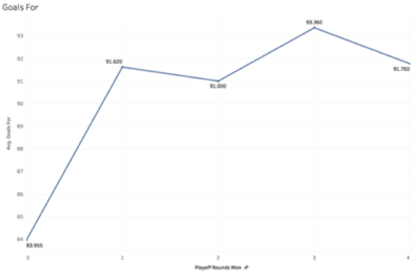
What we see here is that if a team wants to make it out of the first-round gauntlet, it needs to be a proven scoring team. Only teams that can put the puck in the net make it to the second round and beyond.
Another interesting note is which stats AREN’T good predictors of playoff success. Most notable is power play percentage. It’s bolded here because of the amount of times one can hear experts talking about how a team’s dynamic and prolific power play will take them far in the playoffs (hint: it’s a lot). POWER PLAY PERCENTAGE IS NOT A GOOD PREDICTOR OF PLAYOFF SUCCESS. In fact, it’s pretty terrible. Look for yourself:
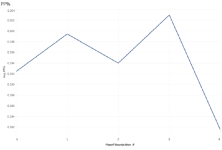
It doesn’t take an expert in statistics to see that there’s no trend there. Penalty kill percentage is a better predictor than power play percentage, but even that isn’t a very reliable indicator. Don’t fall into that trap. Shooting percentage and save percentage, too, are fairly bad tests for playoff success, as there’s no correlation whatsoever between those stats and number of playoff rounds won.
So which teams are in a good position headed into the playoffs? Here’s a chart for comparison:
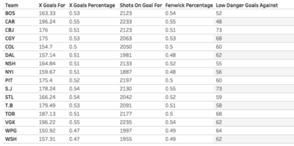
Carolina and Vegas highlight the top of the expected goals leaderboard, with Toronto close behind. Colorado and Dallas find themselves at the bottom. The Canes and Golden Knights also share a significantly higher proportion of shot quality and volume compared to their opponents, while Winnipeg and Washington generally see their opponents control those parameters. It shouldn’t come as a surprise, then, that the same two teams, Vegas and Carolina, lead the playoff teams in 5-on-5 SOG, while the Islanders find themselves lacking in that department. San Jose leads the way in Fenwick percentage, with Vegas, Carolina, and Boston all breathing down the neck of the Sharks. In terms of low danger goals against, the Blue Jackets and Sharks could use some help, as they each allow significantly more low-percentage goals than the teams at the top – Carolina and Boston.
The numbers are favorable for Vegas, Carolina, and Boston all to make deep runs this year, while Winnipeg and Washington may disappoint, as the numbers indicate that they don’t produce enough high-danger chances, and they generally allow their opponents to hold the advantage in offensive possession and quality. Of course, these are the Stanley Cup playoffs, and while we can attempt to use numbers to interpret the mayhem, at the end of the day, the teams that move on are the ones who throw the regular season out the window and elevate their games to another level. Fill out a bracket, sit back, and watch the intensity of playoff hockey unfold.
The post JMPing into the Stanley Cup Playoffs first appeared on 'CATS STATS.
]]>The post Wofford: An Underdog Story? first appeared on 'CATS STATS.
]]>
Wofford is a team that has experts around the country talking. There’s good reason for the chatter: The Terriers, the Southern Conference regular season and tournament champions, finished the season 29-4 at number 19 in the AP poll and number 13 in the NET rankings. Their offense is powerful: they have the 12th most points per game (83) in the country, the 10th best field goal percentage (49.3%), the 4th most three-pointers made (364), and the 2nd best three-point percentage (41.6%). Their defense is strong, too; they allow the 8th fewest total rebounds in the NCAA and are top-40 in average opponent points per game (65.6). They boast the Southern Conference’s Player of the Year in Fletcher Magee, who has made the most three-pointers (151) in the NCAA and holds the nation’s 14th best offensive rating. The numbers confirm the eye test; Wofford has a great basketball team, but the question that matters most is: how far will they make it in the NCAA Tournament? We used JMP Software to help answer that question.
The Terriers’ first opponent is Seton Hall, a team out of the Big East Conference that finished 20-13 on the year. To get an idea of how Wofford squares up against the Pirates, we’ll look at the parameters that increase the chances for a Terrier victory and see how Seton Hall’s numbers match up against each parameter. For example, Wofford is 24-1 this year when they score at least 70 points, while Seton Hall’s opponents this year average 71.5 points per game. In that case, the advantage would go to the Terriers. Similarly, Wofford is 20-0 in games when they record at least 13 assists, and Seton Hall’s opponents average 13.3 assists per game. Looking at other parameters, though, the numbers suggest a tight game. Wofford is 18-0 when their opponents score fewer than 72 points, but the Pirates average just over that with 73.9 points per game. They’re 18-0 when their opponents shoot worse than 43.1% from the field and 23-0 against teams with an adjusted offensive efficiency of 109.2, but Seton Hall averages 44.1% from the field this year and has an adjusted offensive efficiency of 109.3. These numbers don’t suggest any clear favorite, but using JMP to find Seton Hall’s weaknesses, we can see why Wofford opened as a 3-point favorite over the Pirates. Seton Hall is 4-11 when they score fewer than 73 points, while Wofford’s defense is allowing, as noted earlier, just 65.6 points per game. The Pirates are also a dismal 1-5 in games when their opponent shoots better than 40.5% from behind the three-point line, and, of course, Wofford is one of the best three-point-shooting teams in the country, averaging 41.6% from 3.
If the Terriers beat the Pirates, which the numbers suggest is the most likely outcome, they’ll probably face off against the Kentucky Wildcats, barring a massive upset from the other Wildcats at Abilene Christian. Kentucky’s three-point defense is fairly abysmal; their opponents average 35% from 3, good for 221st best in the nation, and have made 256 threes all year, which is 219th best in the nation. They certainly protect the interior well, as their opponents average just 43.6% on 2-point shots (good for 8th in the nation), but when playing a team who lives by the three, having a weak perimeter defense is certainly concerning. Especially concerning is the fact that Wofford is 16-0 when Fletcher Magee, who averages a three-point percentage of 42.8% this year, shoots at least 41.7% from behind the arc.
Wofford can certainly beat Seton Hall, and they shouldn’t be counted out against Kentucky, either. The three-pointer is the Terriers’ greatest asset, and if they make a run, the three-pointer will be their mode of transportation. If Fletcher Magee gets hot and Wofford’s defense holds strong, look for the Terriers to march right into the Sweet 16. If the threes don’t fall, Wofford might be going home earlier than they’d like to.
The post Wofford: An Underdog Story? first appeared on 'CATS STATS.
]]>The post U Must Have Been Cinderella first appeared on 'CATS STATS.
]]>We used Virginia’s statistics from the prior 4 seasons to find, using JMP software, predictors for a Cavalier loss. We found that when UVA allows opponents to score at least 59 points, their win percentage drops to 53%. If opponents score at least 59 points AND Virginia attempts fewer than 17 free throws, that win percentage drops to just 20%; UMBC averaged 73 points per game during the 2018 regular season, and their opponents were averaging just 11 free throws per game. Furthermore, UVA’s team didn’t draw many fouls throughout the year; the team had the 6th least amount of free throw attempts in the NCAA in 2018, and the player who led the team in fouls drawn per 40 minutes, De’Andre Hunter, was out with a broken wrist (speaking of Hunter, his loss was incredibly significant; KenPom listed him as Virginia’s only Major Contributor, meaning he was the only player used on at least 24% of the team’s possessions). So going into the first-round matchup against the Retrievers, Virginia was not likely to shoot very many free throws.
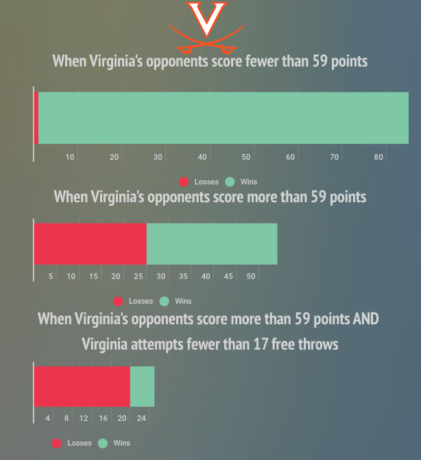
From 2015-2018, Virginia lost 70% of the time when their opponents shot at least 42% from the field and recorded more than 28 total rebounds. Sure enough, the Retrievers averaged a 44% field goal percentage and recorded an average of 35 total rebounds per game in 2018. 25 of UVA’s 26 losses in the previous 4 seasons came against teams with a turnover rate of less than 18.4%; UMBC’s 2018 average was 17.2%. All 26 of their losses came against teams with an adjusted defensive efficiency rating of less than 104. The Retrievers’ number? 102.6. It’s also worth noting that in the last 3 seasons, UMBC is 32-0 when they record at least 15 assists and hold opponents to a field goal percentage of less than 46%. 13 of those games occurred during the 2018 season, and the Retrievers won those games by an average margin of 15 points. Throughout the year, UMBC averaged just over 15 assists per game and their opponents averaged 44% from the field.

So given these stats which describe what teams do to beat the Cavaliers, what actually happened during the game? Well, UMBC put up 74 points, and Virginia shot only 8 free throws. Again, we said UVA wins only 20% of those games. UMBC shot 54.2% from the field and recorded 33 total rebounds; Virginia has lost 70% of those games the last 4 years. The Retrievers recorded 15 assists and held the Cavaliers to a 41% field goal percentage, and as mentioned, UMBC is undefeated the last 3 years in games where both of those boxes are checked.
It’s trivial whether these numbers mean UMBC was poised to beat Virginia. The numbers do show, however, that UVA generally lost to teams who in many ways were statistically similar to UMBC. Still, Virginia was the top seed in the tournament for a reason, and if they had played the way they had played all season, they should have had little problem with the Retrievers. UVA was undefeated in the past 4 seasons against teams with an adjusted offensive efficiency of less than 109.9, and UMBC’s number was 103.1. That difference in AdjOE was the difference between 81st and 206th in the NCAA last year. That less-than-impressive offense had to beat one of the best defenses in the country, and on that night, it’s likely the March Madness effect had some role in giving the Retrievers the hot hand that led them to the commanding and historic victory.
The post U Must Have Been Cinderella first appeared on 'CATS STATS.
]]>The post JAG For A-10 POY: The Numbers Say There’s No Debate first appeared on 'CATS STATS.
]]>
The Atlantic 10 regular season has come to a close, with VCU securing the regular season championship. Now, before the fun gets going in Brooklyn, the biggest question remaining: Who will take home A10 Player of the Year honors? Several players have had noteworthy seasons, including Javon Bess (Saint Louis), Marcus Evans (VCU), Josh Cunningham (Dayton), Justin Kier (George Mason), and Sincere Carry (Duquesne). Each of them has their own legitimate cases for the conference’s top individual honor. No player, though, has meant more to his team and had a more universal impact than Davidson’s Jon Axel Gudmundsson, and a look at Game Score in the A10 all but guarantees his crowning as 2018-19 Player of the Year.
Created by John Hollinger, Game Score is a single number representing a player’s all-around performance in a single game, taking into account each stat in the box score. The stat is calculated as follows:
GS=PTS+ .4FGM – .7FGA – .4(FTA-FTM) + .7OREB + .3DREB + STL + .7AST + .7BLK – .4PF – TO
Note that this metric gives the most weight to points, steals, and turnovers, which are arguably the most productive offensive and defensive stats.
What is a good Game Score, then? The NCAA D-1 average is about 4.2, and the A-10 average comes out around 4. A Game Score of 4, though, indicates a fairly mediocre performance. A good performance would be a score of at least 10, which is in the 90th percentile of all NCAA players, and a great performance would be a score of at least 16, which is in the 99th percentile. The best players put up even better numbers. Duke’s Zion Williamson averages an astounding 21.45 Game Score per game, and the highest average Game Score (as of March 3) belongs to NCAA bound Murray State’s Ja Morant, whose average is a 22.01 Game Score per game.
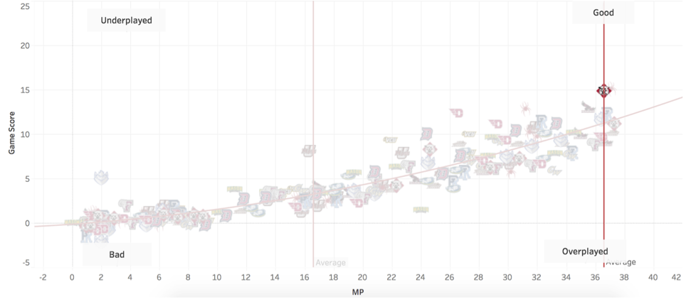
Aside from being an easy way to judge a player’s overall single-game performance, Game Score can have several practical uses. For example, when plotted against average minutes played per game, one can analyze if a player’s ability justifies his playing time. Players farther above the trendline can be considered underutilized and worthy of more playing time (with the exception of Ja Morant, who already plays over 36 minutes per game), as they produce at an above-average level in less time than other players. On the other hand, players well below the trendline, especially those to the right of the NCAA average for minutes played, can be considered overutilized.
Mouse over a team’s logo to find Game Score versus minutes played for a particular player on the team. The best players are found on the top right of the chart, and the not so good on the bottom left. Players with high y-values are outperforming their minutes, and those with low y-values are underperforming.
We can then take this information and assign an efficiency score to players by dividing their average Game Score per game by the average number of minutes played. Among players from over 14 different conferences who play at least 5 minutes per game, NC State’s Ian Steere claims the title as college basketball’s most efficient player with a 1.06 efficiency score. He’s followed by Duke’s Zion Williamson, who has a .761 score, and ETSU’s Octavion Corley, who has a .741 score. Ja Morant ranks 6th with a .606 score.
As of March 6, here is JAG’s dominant perch atop the rest of the A10.
Gudmundsson has recorded a Game Score of at least 20 in nine games this year. NINE. Keep in mind, a score of 20 is indicative of an elite performance, so Jon Axel has put up an elite number in over a quarter of the games he’s played this year. Marcus Evans, Josh Cunningham, Justin Kier, and Sincere Carry COMBINE for TEN games with a Game Score of at least 20. Scoring points and contributing significantly on offense gets you noticed, certainly, as players like Charlie Brown and Obi Toppin can confirm, but when it comes down to being the best player on the floor, one must be present on both sides of the court. The truth is that no one in the Player of the Year conversation even comes close to matching Gudmundsson’s consistent dominance. Another point for JAG.
Game Score paints a clear picture that Jon Axel Gudmundsson is the most complete player in the A10 this year. Looking at the individual numbers, it gets even more clear. He plays an excellent, diverse game on offense, both scoring himself and creating chances for others. He’s 3rd in the conference in points per game (17.2) and 4th in total assists (146). His constant production puts him number one in the league in points produced per game. His presence on offense puts him to the free throw line on a consistent basis, as JAG leads the A10 in free throws made (145), and has the 4th best free throw percentage (82.4%). On defense, he’s just as strong: he leads the A10 in defensive rebounds with 204 (he’s 5th in total rebounds) and is 4th in defensive win shares among all A10 players. JAG is 1st in overall win shares by FAR (he has 6.1, the next closest is SLU’s Javon Bess with 4.9). No player in the conference can claim a top-5 standing in points per game, assists, free throws made, and total rebounds except Jon Axel Gudmundsson. He truly does it all. Game, set, match.
JAG is the best player in the Atlantic 10 this year hands down. There is no comparison to his level of offensive and defensive presence, and both the eye test and the numbers test can prove it. He contributes to every aspect of every game, and his Game Score shows it. At what point should JAG be talked about on a national scale? His nine 20+ Game Score performances have something to say about that. The first step, though, is being awarded A10 Player of the Year, which should almost certainly be a lock for our Icelandic star.
Want to explore our graph for other players? Try the Tableau graph below.

The post JAG For A-10 POY: The Numbers Say There’s No Debate first appeared on 'CATS STATS.
]]>